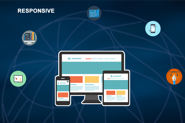
Responsive Design
Responsive Web Design (RWD) allows designers to create websites with fluid layouts and flexible images that automatically adapt according to the size and orientation of the user’s browser to deliver the optimal layout. This means your site looks great and is consistent, regardless of how people are accessing it. At Global Era Infotech, we ensure that your website will deliver a fantastic web user experience on any device.
For example, if you design your website with a desktop computer in mind and somebody visits your website from a mobile device, they will most likely find the resolution less than optimal. This means developers then have to design a mobile version of your site, which means that you have to build and maintain two different websites which means more work.
RWD lets you give the user an optimized website which looks good on devices as large as a giant LCD, to as small as a mobile screen, without cutting out content or features. The key is not changing the HTML, but adding different CSS styling.
We Can:
- Fluid Design with Ease of Maintenance
- Low Development Costs
- Various types of Shared Functionality
- Flexibility to Customers
Responsive Design Services:
- Bootstrap
- Cross Browser Testing
- Adaptive Images
- Responsive Web CSS
- Browser Compatibility
- Mobile Friendly
- User Friendly
We Focused On:
- Customized client services to develop budget solutions.
- Molding the website from scratch to yield high performance responsive websites.
- Redesigning existing websites to make them responsive
- Developing user friendly responsive websites with quality designs, compatible across all multimedia gadgets.